728x90

class="" 안에 원하는 글씨 크기 별로


1.일반 글씨 크기 조절

숫자가 작을 수록 글씨 크기는 커짐

fs-1~6

fs-1

fs-3

fs-6

<p class="fs-1"> 글씨 크기 조절 : fs-1 </p>
<p class="fs-2"> 글씨 크기 조절 : fs-2 </p>
<p class="fs-3"> 글씨 크기 조절 : fs-3 </p>
<p class="fs-4"> 글씨 크기 조절 : fs-4 </p>
<p class="fs-5"> 글씨 크기 조절 : fs-5 </p>
<p class="fs-6"> 글씨 크기 조절 : fs-6 </p>


2.페이지네이션(pagination)

small, medium, large

pagination-sm

pagination-md

pagination-lg

<ul class="pagination pagination-sm">
<ul class="pagination pagination-md">
<ul class="pagination pagination-lg">
728x90
반응형
728x90

처음 부트스트랩을 쓰면서 가장 당황했던게 

css가 적용이 안되는 것이었다. 이틀 꼬박을 헤맸다.

공홈을 몇번을 읽었는데 무슨 소리인지 모르겠어서 환자할 것 같았다.

글을 보는 초보분이 있다면 저와 같은 당황스러움과 시간낭비 없이 효과적으로 빠르게 해결되기를 바란다


기존 html에 css를 적용할 때 선택자(selector) 중에 id와 class선택자를 이용해보자. 가장 쉽고 간단하다.

html의 어떤 태그에 id와 class 속성을 넣고 안에 속성값으로 원하는 이름을 지어줬으면 

얘들 이름을 호명하고 css를 적용시키는 방식이다.


여기까지는 부트스트랩도 같지만 내가 헤맸던 건 부트스트랩을 적용한 html 어디에 넣어서 적용해야할지를 몰랐던 것이다.

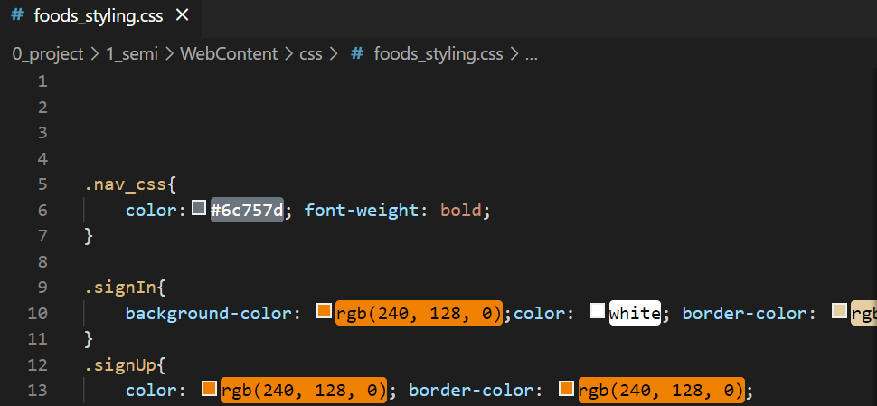
당황스럽게도 태그 안 속성 class="" 안에 지정해주는 것이다. 아래는 나의 진행 중인 프로젝트 파일 css이다


아래처럼 class선택자를 사용하여 class 속성값 "" 안에  클래스명을 지정하면 css가 먹힌다

주의할 점은 태그 마다 먹히는 css가 있고 아니니 부딪혀보자

백그라운드 컬러가 안먹힌다던가 볼드만 먹힌다던가 등등 이런식이다


728x90
반응형

'웹 관련 > Bootstrap' 카테고리의 다른 글

[Bootstrap] 페이지네이션(Pagination)  (0) 2022.05.02
728x90

bootstrap 페이지네이션(Pagination)이란?


아래와 같은 기능이다


양쪽 영어보다 화살표로 심플하게 하고 싶다면

Previous와 Next가 있는 라인을 a태그로 시작하는 아래의 코드로 바꿔주면 된다

      <a class="page-link" href="#" aria-label="Previous">
        <span aria-hidden="true">&laquo;</span>
      </a>


크기조절은 

class="pagination pagination 뒤에 -sm(스몰)이나 -lg(라지) 씩으로 붙여주면 된다

<ul class="pagination pagination-lg">


<nav aria-label="Page navigation example">
  <ul class="pagination justify-content-center">
    <li class="page-item">
      <a class="page-link" href="#" aria-label="Previous">
        <span aria-hidden="true">&laquo;</span>
      </a>
    </li>
    <li class="page-item"><a class="page-link" href="#">1</a></li>
    <li class="page-item"><a class="page-link" href="#">2</a></li>
    <li class="page-item"><a class="page-link" href="#">3</a></li>
    <li class="page-item">
      <a class="page-link" href="#" aria-label="Next">
        <span aria-hidden="true">&raquo;</span>
      </a>
    </li>
  </ul>
</nav>


공홈 페이지네이션 링크

https://getbootstrap.kr/docs/5.0/components/pagination/


페이지네이션

여러 페이지에 일련의 관련 내용이 있음을 나타내는 페이지네이션을 사용한 문서와 예시입니다.

getbootstrap.kr


728x90
반응형

'웹 관련 > Bootstrap' 카테고리의 다른 글

[Bootstrap] 부트스트랩 코드에 CSS 적용시키기  (0) 2022.05.02
728x90


페이지네이션 설명

https://rise-up.tistory.com/434


Previous와 Next 영어 부담스러워하는 사람들도 있을 것 같고

화살표가 더 심플하고 직관적이어서 양옆 <<>>로 바꿈

      <a class="page-link" href="#" aria-label="Previous">
        <span aria-hidden="true">&laquo;</span>
      </a>


크기를 작게 변경

<ul class="pagination pagination-sm">


<nav aria-label="Page navigation example">
  <ul class="pagination justify-content-center">
    <li class="page-item">
      <a class="page-link" href="#" aria-label="Previous">
        <span aria-hidden="true">&laquo;</span>
      </a>
    </li>
    <li class="page-item"><a class="page-link" href="#">1</a></li>
    <li class="page-item"><a class="page-link" href="#">2</a></li>
    <li class="page-item"><a class="page-link" href="#">3</a></li>
    <li class="page-item">
      <a class="page-link" href="#" aria-label="Next">
        <span aria-hidden="true">&raquo;</span>
      </a>
    </li>
  </ul>
</nav>


공홈 페이지네이션 링크

https://getbootstrap.kr/docs/5.0/components/pagination/


페이지네이션

여러 페이지에 일련의 관련 내용이 있음을 나타내는 페이지네이션을 사용한 문서와 예시입니다.

getbootstrap.kr


728x90
반응형
728x90


부트스트랩 공홈의 예제 템플릿 중 블로그형 템플릿 하나를 골라서

이것저것 적용해보았다 


맛조 - 양식
양식 이미지
중화요리 팔공 리뷰
중식
중화요리 팔공

22.02.22 | 조회수 50회

위치 : 서울 관악구 신림동 10-621 지하 1층

간단 소개

푸짐한 양과 아낌없는 재료

중화요리 팔공 리뷰
중식
짜장면집

20.02.10 | 조회수 50회

위치 : 서울 관악구 신원로 16 1층

간단 소개

이보다 쌀 수 있을까? 극한의 가성비

...
중화요리 팔공

22.02.22 | 조회수 50회

위치 : 서울 관악구 신림동 10-621 지하 1층

간단 소개

푸짐한 양과 아낌없는 재료

중식

중화요리 팔공

22.02.22 | 조회수 50회

위치 : 서울 관악구 신림동 10-621 지하 1층

간단 소개

아낌 없는 재료와 푸짐한 양

중화요리 팔공 내돈내산 후기
PlaceholderThumbnail
중식

Post title

Nov 11

This is a wider card with supporting text below as a natural lead-in to additional content.

Continue reading
PlaceholderThumbnail

From the Firehose

Sample blog post

This blog post shows a few different types of content that’s supported and styled with Bootstrap. Basic typography, lists, tables, images, code, and more are all supported as expected.


This is some additional paragraph placeholder content. It has been written to fill the available space and show how a longer snippet of text affects the surrounding content. We'll repeat it often to keep the demonstration flowing, so be on the lookout for this exact same string of text.

Blockquotes

This is an example blockquote in action:

Quoted text goes here.

This is some additional paragraph placeholder content. It has been written to fill the available space and show how a longer snippet of text affects the surrounding content. We'll repeat it often to keep the demonstration flowing, so be on the lookout for this exact same string of text.

Example lists

This is some additional paragraph placeholder content. It's a slightly shorter version of the other highly repetitive body text used throughout. This is an example unordered list:

  • First list item
  • Second list item with a longer description
  • Third list item to close it out

And this is an ordered list:

  1. First list item
  2. Second list item with a longer description
  3. Third list item to close it out

And this is a definition list:

HyperText Markup Language (HTML)
The language used to describe and define the content of a Web page
Cascading Style Sheets (CSS)
Used to describe the appearance of Web content
JavaScript (JS)
The programming language used to build advanced Web sites and applications

Inline HTML elements

HTML defines a long list of available inline tags, a complete list of which can be found on the Mozilla Developer Network.

  • To bold text, use <strong>.
  • To italicize text, use <em>.
  • Abbreviations, like HTML should use <abbr>, with an optional title attribute for the full phrase.
  • Citations, like — Mark Otto, should use <cite>.
  • Deleted text should use <del> and inserted text should use <ins>.
  • Superscript text uses <sup> and subscript text uses <sub>.

Most of these elements are styled by browsers with few modifications on our part.

Heading

This is some additional paragraph placeholder content. It has been written to fill the available space and show how a longer snippet of text affects the surrounding content. We'll repeat it often to keep the demonstration flowing, so be on the lookout for this exact same string of text.

Sub-heading

This is some additional paragraph placeholder content. It has been written to fill the available space and show how a longer snippet of text affects the surrounding content. We'll repeat it often to keep the demonstration flowing, so be on the lookout for this exact same string of text.

Example code block

This is some additional paragraph placeholder content. It's a slightly shorter version of the other highly repetitive body text used throughout.
Another blog post

This is some additional paragraph placeholder content. It has been written to fill the available space and show how a longer snippet of text affects the surrounding content. We'll repeat it often to keep the demonstration flowing, so be on the lookout for this exact same string of text.

Longer quote goes here, maybe with some emphasized text in the middle of it.

This is some additional paragraph placeholder content. It has been written to fill the available space and show how a longer snippet of text affects the surrounding content. We'll repeat it often to keep the demonstration flowing, so be on the lookout for this exact same string of text.

Example table

And don't forget about tables in these posts:

Name Upvotes Downvotes
Alice 10 11
Bob 4 3
Charlie 7 9
Totals 21 23

This is some additional paragraph placeholder content. It's a slightly shorter version of the other highly repetitive body text used throughout.

New feature

This is some additional paragraph placeholder content. It has been written to fill the available space and show how a longer snippet of text affects the surrounding content. We'll repeat it often to keep the demonstration flowing, so be on the lookout for this exact same string of text.

  • First list item
  • Second list item with a longer description
  • Third list item to close it out

This is some additional paragraph placeholder content. It's a slightly shorter version of the other highly repetitive body text used throughout.

About

Customize this section to tell your visitors a little bit about your publication, writers, content, or something else entirely. Totally up to you.

Elsewhere

  1. GitHub
  2. Twitter
  3. Facebook
<!DOCTYPE html>
<html lang="en">
<head>
    <meta charset="UTF-8">
    <meta http-equiv="X-UA-Compatible" content="IE=edge">
    <meta name="viewport" content="width=device-width, initial-scale=1">
<title>맛조 - 양식</title>


<!-- <link href="css/foods_styling.css" rel="stylesheet"> -->
<link href="https://cdn.jsdelivr.net/npm/bootstrap@5.1.3/dist/css/bootstrap.min.css" rel="stylesheet" integrity="sha384-1BmE4kWBq78iYhFldvKuhfTAU6auU8tT94WrHftjDbrCEXSU1oBoqyl2QvZ6jIW3" crossorigin="anonymous">

<link rel="stylesheet" href="css/foods_styling.css" >

<style>
  .bd-placeholder-img {
    font-size: 1.125rem;
    text-anchor: middle;
    -webkit-user-select: none;
    -moz-user-select: none;
    user-select: none;
    }

    @media (min-width: 768px) {
    .bd-placeholder-img-lg {
        font-size: 3.5rem;
      }
    }
</style>

</head>
<body>


<div class="container">
<header class="blog-header py-3">
  <div class="row flex-nowrap justify-content-between align-items-center">
    <div class="col-4 pt-1">
      <a class="link-secondary" href="#"> </a>
    </div>
    <div class="col-4 text-center">
      <a class="blog-header-logo text-dark" href="#">맛조(이미지 대체)</a>
    </div>
    <div class="col-4 d-flex justify-content-end align-items-center">
      <a class="link-secondary" href="#" aria-label="Search">
      </a>
      </a>
      <a class="btn btn-sm btn-outline-secondary signIn" href="#">Sign in</a>
      <a class="btn btn-sm btn-outline-secondary signUp" href="#">Sign up</a>
    </div>
  </div>
</header>

<div class="bbb nav-scroller py-1 mb-2 ">
  <nav class="nav d-flex justify-content-between" >
    <a class="p-2 text-decoration-none nav_css" href="#">한식</a>
    <a class="p-2 text-decoration-none nav_css" href="#">중식</a>
    <a class="p-2 text-decoration-none nav_css" href="#">양식</a>
    <a class="p-2 text-decoration-none nav_css" href="#">일식</a>
    <a class="p-2 text-decoration-none nav_css" href="#">디저트</a>
    <a class="p-2 text-decoration-none nav_css" href="#">공지사항</a>
  </nav>
</div>
</div>

<main class="container">
<div class="p-4 p-md-5 mb-4 text-white bg-dark">
  양식 이미지
</div>


<div class="card mb-3 cardInline" style="max-width: 380px;"> <!-- 380px -->
  <div class="row g-0">
    <div class="col-md-6">
      <img src="img/review01 palgong.png" class="img-fluid rounded-start" alt="중화요리 팔공 리뷰">
    </div>
    <div class="col-md-6">
      <div class="card-body">
        <strong class="d-inline-block mb-lg-1 text-success reviewCategory">중식</strong>
        <h5 class="card-title cardTitle">중화요리 팔공</h5>
        <p class="card-text mb-1 reviewDate">22.02.22 | 조회수 50회</p>
        <p class="card-text mb-auto reviewNormal">위치 : 서울 관악구 신림동 10-621 지하 1층</p>
        <p class="card-text mt-3 mb-auto reviewFeatureTitle">간단 소개</p>
        <p class="card-text reviewNormal">푸짐한 양과 아낌없는 재료</p>
        <!-- <p class="card-text"><small class="text-muted">Last updated 3 mins ago</small></p> -->
      </div>
    </div>
  </div>
</div>

<div class="card mb-3 cardInline" style="max-width: 380px;"> <!-- 380px -->
  <div class="row g-0">
    <div class="col-md-6">
      <img src="img/review02 zzangjang.png" class="img-fluid rounded-start" alt="중화요리 팔공 리뷰">
    </div>
    <div class="col-md-6">
      <div class="card-body">
        <strong class="d-inline-block mb-1 text-success reviewCategory">중식</strong>
        <h5 class="card-title cardTitle">짜장면집</h5>
        <p class="card-text mb-1 reviewDate">20.02.10 | 조회수 50회</p>
        <p class="card-text mb-auto reviewNormal">위치 : 서울 관악구 신원로 16 1층</p>
        <p class="card-text mt-3 mb-auto reviewFeatureTitle">간단 소개</p>
        <p class="card-text reviewNormal">이보다 쌀 수 있을까? 극한의 가성비</p>
        <!-- <p class="card-text"><small class="text-muted">Last updated 3 mins ago</small></p> -->
      </div>
    </div>
  </div>
</div>


<div class="card mb-3" style="max-width: 540px;">
  <div class="row g-0">
    <div class="col-md-4">
      <img src="img/review01 palgong.png" class="img-fluid rounded-start" alt="...">
    </div>
    <div class="col-md-8">
      <div class="card-body">
        <h5 class="card-title ">중화요리 팔공</h5>
        <p class="card-text mb-1 reviewDate">22.02.22 | 조회수 50회</p>
        <p class="card-text mb-auto reviewNormal">위치 : 서울 관악구 신림동 10-621 지하 1층</p>
        <p class="card-text mt-3 mb-auto reviewFeatureTitle">간단 소개</p>
        <p class="card-text reviewNormal">푸짐한 양과 아낌없는 재료</p>
        <!-- <p class="card-text"><small class="text-muted">Last updated 3 mins ago</small></p> -->
      </div>
    </div>
  </div>
</div>


<div class="row mb-2">
  <div class="col-md-6">
    <div class="row g-0 border rounded overflow-hidden flex-md-row mb-4 shadow-sm h-md-250 position-relative">
      <div class="col p-4 d-flex flex-column position-static">
        <strong class="d-inline-block mb-2 text-success ">중식</strong>
        <h3 class="mb-0 ">중화요리 팔공</h3>
        <div class="mb-1 text-muted reviewDate">22.02.22 | 조회수 50회</div>
        <p class="card-text mb-auto reviewLocation">위치 : 서울 관악구 신림동 10-621 지하 1층</p>
        <pre class="reviewFeatureTitle">간단 소개</pre>
        <p class="mb-auto">아낌 없는 재료와 푸짐한 양</p>
        <a href="https://zingunt2.tistory.com/82" target="_blank" class="stretched-link">중화요리 팔공 내돈내산 후기</a>
      </div>
      <div class="col-auto d-none d-lg-block">
        <svg class="bd-placeholder-img" width="200" height="250" xmlns="http://www.w3.org/2000/svg" role="img" aria-label="Placeholder: Thumbnail" preserveAspectRatio="xMidYMid slice" focusable="false"><title>Placeholder</title><rect width="100%" height="100%" fill="#55595c"/><text x="50%" y="50%" fill="#eceeef" dy=".3em">Thumbnail</text></svg>

      </div>
    </div>
  </div>
  <div class="col-md-6">
    <div class="row g-0 border rounded overflow-hidden flex-md-row mb-4 shadow-sm h-md-250 position-relative">
      <div class="col p-4 d-flex flex-column position-static">
        <strong class="d-inline-block mb-2 text-success" >중식</strong>
        <h3 class="mb-0">Post title</h3>
        <div class="mb-1 text-muted">Nov 11</div>
        <p class="mb-auto">This is a wider card with supporting text below as a natural lead-in to additional content.</p>
        <a href="#" class="stretched-link">Continue reading</a>
      </div>
      <div class="col-auto d-none d-lg-block">
        <svg class="bd-placeholder-img" width="200" height="250" xmlns="http://www.w3.org/2000/svg" role="img" aria-label="Placeholder: Thumbnail" preserveAspectRatio="xMidYMid slice" focusable="false"><title>Placeholder</title><rect width="100%" height="100%" fill="#55595c"/><text x="50%" y="50%" fill="#eceeef" dy=".3em">Thumbnail</text></svg>

      </div>
    </div>
  </div>
</div>

<div class="row g-5">
  <div class="col-md-8">
    <h3 class="pb-4 mb-4 fst-italic border-bottom">
      From the Firehose
    </h3>

    <article class="blog-post">
      <h2 class="blog-post-title">Sample blog post</h2>
      <p class="blog-post-meta">January 1, 2021 by <a href="#">Mark</a></p>

      <p>This blog post shows a few different types of content that’s supported and styled with Bootstrap. Basic typography, lists, tables, images, code, and more are all supported as expected.</p>
      <hr>
      <p>This is some additional paragraph placeholder content. It has been written to fill the available space and show how a longer snippet of text affects the surrounding content. We'll repeat it often to keep the demonstration flowing, so be on the lookout for this exact same string of text.</p>
      <h2>Blockquotes</h2>
      <p>This is an example blockquote in action:</p>
      <blockquote class="blockquote">
        <p>Quoted text goes here.</p>
      </blockquote>
      <p>This is some additional paragraph placeholder content. It has been written to fill the available space and show how a longer snippet of text affects the surrounding content. We'll repeat it often to keep the demonstration flowing, so be on the lookout for this exact same string of text.</p>
      <h3>Example lists</h3>
      <p>This is some additional paragraph placeholder content. It's a slightly shorter version of the other highly repetitive body text used throughout. This is an example unordered list:</p>
      <ul>
        <li>First list item</li>
        <li>Second list item with a longer description</li>
        <li>Third list item to close it out</li>
      </ul>
      <p>And this is an ordered list:</p>
      <ol>
        <li>First list item</li>
        <li>Second list item with a longer description</li>
        <li>Third list item to close it out</li>
      </ol>
      <p>And this is a definition list:</p>
      <dl>
        <dt>HyperText Markup Language (HTML)</dt>
        <dd>The language used to describe and define the content of a Web page</dd>
        <dt>Cascading Style Sheets (CSS)</dt>
        <dd>Used to describe the appearance of Web content</dd>
        <dt>JavaScript (JS)</dt>
        <dd>The programming language used to build advanced Web sites and applications</dd>
      </dl>
      <h2>Inline HTML elements</h2>
      <p>HTML defines a long list of available inline tags, a complete list of which can be found on the <a href="https://developer.mozilla.org/en-US/docs/Web/HTML/Element">Mozilla Developer Network</a>.</p>
      <ul>
        <li><strong>To bold text</strong>, use <code class="language-plaintext highlighter-rouge">&lt;strong&gt;</code>.</li>
        <li><em>To italicize text</em>, use <code class="language-plaintext highlighter-rouge">&lt;em&gt;</code>.</li>
        <li>Abbreviations, like <abbr title="HyperText Markup Langage">HTML</abbr> should use <code class="language-plaintext highlighter-rouge">&lt;abbr&gt;</code>, with an optional <code class="language-plaintext highlighter-rouge">title</code> attribute for the full phrase.</li>
        <li>Citations, like <cite>— Mark Otto</cite>, should use <code class="language-plaintext highlighter-rouge">&lt;cite&gt;</code>.</li>
        <li><del>Deleted</del> text should use <code class="language-plaintext highlighter-rouge">&lt;del&gt;</code> and <ins>inserted</ins> text should use <code class="language-plaintext highlighter-rouge">&lt;ins&gt;</code>.</li>
        <li>Superscript <sup>text</sup> uses <code class="language-plaintext highlighter-rouge">&lt;sup&gt;</code> and subscript <sub>text</sub> uses <code class="language-plaintext highlighter-rouge">&lt;sub&gt;</code>.</li>
      </ul>
      <p>Most of these elements are styled by browsers with few modifications on our part.</p>
      <h2>Heading</h2>
      <p>This is some additional paragraph placeholder content. It has been written to fill the available space and show how a longer snippet of text affects the surrounding content. We'll repeat it often to keep the demonstration flowing, so be on the lookout for this exact same string of text.</p>
      <h3>Sub-heading</h3>
      <p>This is some additional paragraph placeholder content. It has been written to fill the available space and show how a longer snippet of text affects the surrounding content. We'll repeat it often to keep the demonstration flowing, so be on the lookout for this exact same string of text.</p>
      <pre><code>Example code block</code></pre>
      <p>This is some additional paragraph placeholder content. It's a slightly shorter version of the other highly repetitive body text used throughout.</p>
    </article>

    <article class="blog-post">
      <h2 class="blog-post-title">Another blog post</h2>
      <p class="blog-post-meta">December 23, 2020 by <a href="#">Jacob</a></p>

      <p>This is some additional paragraph placeholder content. It has been written to fill the available space and show how a longer snippet of text affects the surrounding content. We'll repeat it often to keep the demonstration flowing, so be on the lookout for this exact same string of text.</p>
      <blockquote>
        <p>Longer quote goes here, maybe with some <strong>emphasized text</strong> in the middle of it.</p>
      </blockquote>
      <p>This is some additional paragraph placeholder content. It has been written to fill the available space and show how a longer snippet of text affects the surrounding content. We'll repeat it often to keep the demonstration flowing, so be on the lookout for this exact same string of text.</p>
      <h3>Example table</h3>
      <p>And don't forget about tables in these posts:</p>
      <table class="table">
        <thead>
          <tr>
            <th>Name</th>
            <th>Upvotes</th>
            <th>Downvotes</th>
          </tr>
        </thead>
        <tbody>
          <tr>
            <td>Alice</td>
            <td>10</td>
            <td>11</td>
          </tr>
          <tr>
            <td>Bob</td>
            <td>4</td>
            <td>3</td>
          </tr>
          <tr>
            <td>Charlie</td>
            <td>7</td>
            <td>9</td>
          </tr>
        </tbody>
        <tfoot>
          <tr>
            <td>Totals</td>
            <td>21</td>
            <td>23</td>
          </tr>
        </tfoot>
      </table>

      <p>This is some additional paragraph placeholder content. It's a slightly shorter version of the other highly repetitive body text used throughout.</p>
    </article>

    <article class="blog-post">
      <h2 class="blog-post-title">New feature</h2>
      <p class="blog-post-meta">December 14, 2020 by <a href="#">Chris</a></p>

      <p>This is some additional paragraph placeholder content. It has been written to fill the available space and show how a longer snippet of text affects the surrounding content. We'll repeat it often to keep the demonstration flowing, so be on the lookout for this exact same string of text.</p>
      <ul>
        <li>First list item</li>
        <li>Second list item with a longer description</li>
        <li>Third list item to close it out</li>
      </ul>
      <p>This is some additional paragraph placeholder content. It's a slightly shorter version of the other highly repetitive body text used throughout.</p>
    </article>

    <nav class="blog-pagination" aria-label="Pagination">
      <a class="btn btn-outline-primary" href="#">Older</a>
      <a class="btn btn-outline-secondary disabled">Newer</a>
    </nav>

  </div>

  <div class="col-md-4">
    <div class="position-sticky" style="top: 2rem;">
      <div class="p-4 mb-3 bg-light rounded">
        <h4 class="fst-italic">About</h4>
        <p class="mb-0">Customize this section to tell your visitors a little bit about your publication, writers, content, or something else entirely. Totally up to you.</p>
      </div>

      <div class="p-4">
        <h4 class="fst-italic">Archives</h4>
        <ol class="list-unstyled mb-0">
          <li><a href="#">March 2021</a></li>
          <li><a href="#">February 2021</a></li>
          <li><a href="#">January 2021</a></li>
          <li><a href="#">December 2020</a></li>
          <li><a href="#">November 2020</a></li>
          <li><a href="#">October 2020</a></li>
          <li><a href="#">September 2020</a></li>
          <li><a href="#">August 2020</a></li>
          <li><a href="#">July 2020</a></li>
          <li><a href="#">June 2020</a></li>
          <li><a href="#">May 2020</a></li>
          <li><a href="#">April 2020</a></li>
        </ol>
      </div>

      <div class="p-4">
        <h4 class="fst-italic">Elsewhere</h4>
        <ol class="list-unstyled">
          <li><a href="#">GitHub</a></li>
          <li><a href="#">Twitter</a></li>
          <li><a href="#">Facebook</a></li>
        </ol>
      </div>
    </div>
  </div>
</div>

</main>

<footer class="blog-footer">
<p>Blog template built for <a href="https://getbootstrap.com/">Bootstrap</a> by <a href="https://twitter.com/mdo">@mdo</a>.</p>
<p>
  <a href="#">top</a>
</p>
</footer>


<script src="https://cdn.jsdelivr.net/npm/bootstrap@5.1.3/dist/js/bootstrap.bundle.min.js" integrity="sha384-ka7Sk0Gln4gmtz2MlQnikT1wXgYsOg+OMhuP+IlRH9sENBO0LRn5q+8nbTov4+1p" crossorigin="anonymous"></script>
</body>
</html>
728x90
반응형
728x90

어떻게 나오는지 한번씩 시험삼아 해 본 코드


Hello, world!

Hello, world!

To switch directories, type cd followed by the name of the directory.
To edit settings, press ctrl + , This text is meant to be treated as sample output from a computer program. 볼드체 적용?


# First Last Handle
1 Mark Otto @mdo
2 Jacob Thornton @fat
3 Larry the Bird @twitter
primary
secondary
success
primary secondary ... primary secondary


Example heading New

728x90
반응형
728x90

헤드 태그 사이에 1개

<link href="https://cdn.jsdelivr.net/npm/bootstrap@5.1.3/dist/css/bootstrap.min.css" rel="stylesheet" integrity="sha384-1BmE4kWBq78iYhFldvKuhfTAU6auU8tT94WrHftjDbrCEXSU1oBoqyl2QvZ6jIW3" crossorigin="anonymous">


바디 태그 끝나기 전 1개

  <script src="https://cdn.jsdelivr.net/npm/bootstrap@5.1.3/dist/js/bootstrap.bundle.min.js" integrity="sha384-ka7Sk0Gln4gmtz2MlQnikT1wXgYsOg+OMhuP+IlRH9sENBO0LRn5q+8nbTov4+1p" crossorigin="anonymous"></script>


<!DOCTYPE html>
<html lang="en">
<head>
<meta charset="UTF-8">
<title>Document</title>

<link href="https://cdn.jsdelivr.net/npm/bootstrap@5.1.3/dist/css/bootstrap.min.css" rel="stylesheet" integrity="sha384-1BmE4kWBq78iYhFldvKuhfTAU6auU8tT94WrHftjDbrCEXSU1oBoqyl2QvZ6jIW3" crossorigin="anonymous">


<style>
#carouselExampleControls{
  width: 300px; height: 200px;
}

</style>

</head>
<body>


    <nav class="navbar navbar-expand-lg navbar-light bg-light">
        <div class="container-fluid">
          <a class="navbar-brand" href="#">Navbar</a>
          <button class="navbar-toggler" type="button" data-bs-toggle="collapse" data-bs-target="#navbarSupportedContent" aria-controls="navbarSupportedContent" aria-expanded="false" aria-label="Toggle navigation">
            <span class="navbar-toggler-icon"></span>
          </button>
          <div class="collapse navbar-collapse" id="navbarSupportedContent">
            <ul class="navbar-nav me-auto mb-2 mb-lg-0">
              <li class="nav-item">
                <a class="nav-link active" aria-current="page" href="#">Home</a>
              </li>
              <li class="nav-item">
                <a class="nav-link" href="#">Link</a>
              </li>
              <li class="nav-item dropdown">
                <a class="nav-link dropdown-toggle" href="#" id="navbarDropdown" role="button" data-bs-toggle="dropdown" aria-expanded="false">
                  Dropdown
                </a>
                <ul class="dropdown-menu" aria-labelledby="navbarDropdown">
                  <li><a class="dropdown-item" href="#">Action</a></li>
                  <li><a class="dropdown-item" href="#">Another action</a></li>
                  <li><hr class="dropdown-divider"></li>
                  <li><a class="dropdown-item" href="#">Something else here</a></li>
                </ul>
              </li>
              <li class="nav-item">
                <a class="nav-link disabled">Disabled</a> 
              </li>
            </ul>
            <form class="d-flex">
              <input class="form-control me-2" type="search" placeholder="Search" aria-label="Search">
              <button class="btn btn-outline-success" type="submit">Search</button>
            </form>
          </div>
        </div>
      </nav>

    <div class="card" style="width: 18rem;">
        <img src="..." class="card-img-top" alt="...">
        <div class="card-body">
          <h5 class="card-title">Card title</h5>
          <p class="card-text">Some quick example text to build on the card title and make up the bulk of the card's content.</p>
          <a href="#" class="btn btn-primary">Go somewhere</a>
        </div>
      </div>

      <div id="carouselExampleControls" class="carousel slide" data-bs-ride="carousel" >
        <div class="carousel-inner">
          <div class="carousel-item active">
            <img src="WebContent/startbootstrap-sb-admin-2-gh-pages/startbootstrap-sb-admin-2-gh-pages/img/세미 중식1.png" class="d-block w-100" alt="...">
          </div>
          <div class="carousel-item">
            <img src="WebContent/startbootstrap-sb-admin-2-gh-pages/startbootstrap-sb-admin-2-gh-pages/img/세미 중식1.png" class="d-block w-100" alt="...">
          </div>
          <div class="carousel-item">
            <img src="WebContent/startbootstrap-sb-admin-2-gh-pages/startbootstrap-sb-admin-2-gh-pages/img/세미 중식1.png" class="d-block w-100" alt="...">
          </div>
        </div>
        <button class="carousel-control-prev" type="button" data-bs-target="#carouselExampleControls" data-bs-slide="prev">
          <span class="carousel-control-prev-icon" aria-hidden="true"></span>
          <span class="visually-hidden">Previous</span>
        </button>
        <button class="carousel-control-next" type="button" data-bs-target="#carouselExampleControls" data-bs-slide="next">
          <span class="carousel-control-next-icon" aria-hidden="true"></span>
          <span class="visually-hidden">Next</span>
        </button>
      </div>


    <script src="https://cdn.jsdelivr.net/npm/bootstrap@5.1.3/dist/js/bootstrap.bundle.min.js" integrity="sha384-ka7Sk0Gln4gmtz2MlQnikT1wXgYsOg+OMhuP+IlRH9sENBO0LRn5q+8nbTov4+1p" crossorigin="anonymous"></script>
    
</body>
</html>
728x90
반응형

+ Recent posts